Russian Twitter Trolls
- By Quentin Ikeno
- Mon 18 June 2018
Introduction
As part of the House Intelligence Committee investigation into how Russia may have influenced the 2016 US Election, Twitter released the screen names of almost 3000 Twitter accounts believed to be connected to Russia's Internet Research Agency, a company known for operating social media troll accounts. The goal of these accounts was to tweet controversial and divisive content in order to divide Americans and influence the 2016 U.S. presidential election.
The goal of this project will be to visualize the Russian troll data and to see what information can be obtained from it. The data comes from a team at NBC News who were able to reconstruct a subset of the Twitter data from the Russian Trolls.
#set working directory
setwd("C:/Users/Quentin/Documents/Data_Side_Projects/russian_trolls")

#read in csvs
tweets <- read.csv(
  'tweets.csv'
  )
users <- read.csv(
  'users.csv'
  )
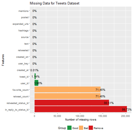
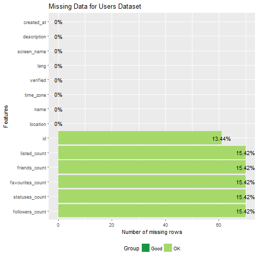
Missing Data
#plot missing data
plot_missing(tweets, "Missing Data for Tweets Dataset")
plot_missing(users, "Missing Data for Users Dataset")
The tweets data had four collumns with over 70% missing data--in fact, the "in_reply_to_satus_id" collumn had 100% missing data. Thus, I decided to remove these collumns from the tweets data.
#remove collumns with a missing majority of rows
tweets <- subset(tweets,
                 select = -c(favorite_count,
                             retweet_count,
                             retweeted_status_id,
                             in_reply_to_status_id)
                 )
Cleaning Dates
Before we do any time series visualizations, the dates data need to be cleaned. Dates in the users dataset are of the form "Wed Jan 07 04:38:02 +0000 2009" and dates in the tweets datset are of the form "3/22/2016 6:31:42 PM" so we need to make sure that the dates in both datsets are in the same format. I decided to change the dates into the latter format using tidyr and lubridate.
#split up date-time data in users data frame
users <- users %>% separate(created_at,
                  c('weekday', 'month', 'day', 'time', 'zone', 'year'),
                  sep = ' ',
                  extra = "drop",
                  fill = "right")

#recombine year, month, and day collumns into a collumn of dates
users$date <- with(users, paste(year, month, day, sep = "-"))

#convert time from character to time
users$time <- times(users$time)

#combine dates and times
users$created_date_time <- with(users, paste(date, time, sep = " "))

#convert date-times from character class to POSIXct
users$created_date_time <- parse_date_time(users$created_date_time,
                                           "%Y-%b-%d %H:%M:%S")
## Warning: 70 failed to parse.
#change abbreviated weekday to full spelling
users$weekday <- weekdays(users$created_date_time)
users$weekday <- ordered(users$weekday,
                         levels = c("Sunday", "Monday", "Tuesday", "Wednesday",                                              "Thursday", "Friday", "Saturday"))

#drop individual collumns from users
users <- subset(users, select = -c(zone, date, time) )

#convert tweets date-time data to POSIXct
tweets$created_str <- ymd_hms(tweets$created_str)

#create date, weekday, year, month, and day variables
tweets$hour <- strftime(tweets$created_str, format = "%H")
tweets$date <- as.Date(tweets$created_str)
tweets$weekday <- weekdays(tweets$created_str)
tweets$weekday <- ordered(tweets$weekday,
                         levels = c("Sunday", "Monday", "Tuesday", "Wednesday",                                              "Thursday", "Friday", "Saturday"))
tweets$year <- year(tweets$created_str)
tweets$month <- month(tweets$created_str, label = TRUE, abbr = TRUE)
tweets$day <- day(tweets$created_str)
tweets$week <- week(tweets$created_str)
Data Visualizations
Time Series Visualizations
#group accounts by month and year and list the number of accounts per month
accounts.monthly <- users %>%
  group_by(year, month) %>%
  summarize(n = n()) %>%
  drop_na(month) %>%
  ungroup() %>%
  complete(year, month, fill = list(n = 0)) %>%
  mutate(date = paste(month, '01', year, sep = '-')) %>%
  mutate(date = as.Date(date, format = '%b-%d-%Y'))

#plot Russian account creation
ggplot(data = accounts.monthly,
      aes(x = date, y = n)) +
  geom_line(size = .75, color = '#2C69B0') +
  theme_minimal() +
  theme(panel.grid.major.x = element_blank(),
        panel.grid.minor = element_blank()) +
  ggtitle('Number of New Russian Accounts by Month') +
  ylab('Russian Twitter Accounts') +
  xlab('Account Creation Date') +
  annotate("text",
           label = 'bold("Nov. 2016\nUnited States\nPresidential\nElection")',
           x = as.Date('2016-04-08'),
           y = 55,
           hjust = 0,
           parse = TRUE) +
  annotate("pointrange",
           x = as.Date('2016-11-08'),
           y = 0,
           ymin = 0,
           ymax = 50) +
  annotate("text",
           label = 'bold("May. 2014\nUkraine\nPresidential\nElection")',
           x = as.Date('2014-02-01'),
           y = 74,
           hjust = 0,
           parse = TRUE) +
  annotate("pointrange",
           x = as.Date('2014-05-01'),
           y = 65,
           ymin = 65,
           ymax = 70) +
  scale_x_date(limits = as.Date(c('2008-09-01', '2017-04-01')))
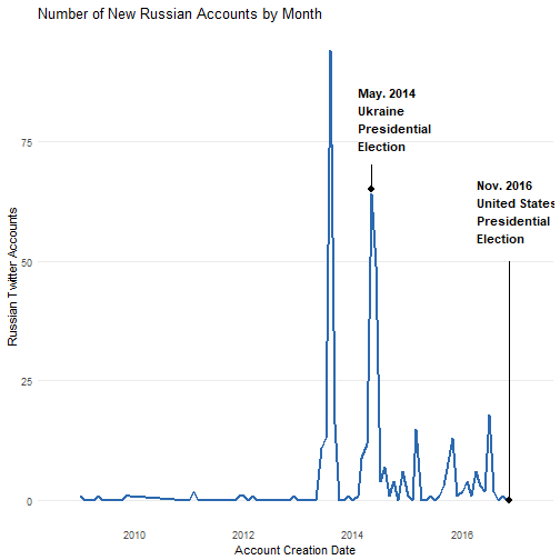
What immediately caught my attention was that the majority of Russian accounts were created in 2013 and 2014--several years in advance of the 2016 US presidential election. Another thing I noticed, was that the second peak in account creation seems to coincide with Russia's interference in the May 2014 Ukranian election, when Russian hackers launched cyber-attacks on servers at Ukraine's central election commision. That said, this connection may be a coincidence.
#group tweets by month and year and list the number of tweets per month
tweets.monthly <- tweets %>%
  group_by(year, month) %>%
  summarize(n = n()) %>%
  drop_na(month) %>%
  ungroup() %>%
  complete(year, month, fill = list(n = 0)) %>%
  mutate(date = paste(month, '01', year, sep = '-')) %>%
  mutate(date = as.Date(date, format = '%b-%d-%Y'))

#plot Russian tweets
ggplot(data = tweets.monthly,
      aes(x = date, y = n)) +
  geom_line(size = .75, color = '#2C69B0') +
  theme_minimal() +
  ggtitle('Number of Russian Tweets by Month') +
  ylab('Tweets') +
  xlab('Tweet Date') +
  annotate("text",
           label = 'bold("Nov. 2016\nUS Presidential\nElection")',
           x = as.Date('2016-11-08'),
           y = 36000,
           hjust = 0,
           parse = TRUE) +
  annotate("pointrange",
           x = as.Date('2016-11-08'),
           y = 21805,
           ymin = 21805,
           ymax = 34500) +
  annotate("text",
           label = 'bold("July 2016\nDonald Trump Accepts Republican Nomination\nHillary Clinton Accepts Democratic Nomination")',
           x = as.Date('2014-04-01'),
           y = 15000,
           hjust = 0,
           parse = TRUE) +
  annotate("pointrange",
           x = as.Date('2016-7-01'),
           y = 7278,
           ymin = 7278,
           ymax = 14000) +
  annotate("text",
           label = 'bold("Jan. 2017\nDonald Trump Sworn\nin as US President")',
           x = as.Date('2017-01-01'),
           y = 25000,
           hjust = 0,
           parse = TRUE) +
  annotate("pointrange",
           x = as.Date('2017-01-01'),
           y = 21067,
           ymin = 21067,
           ymax = 23500) +
  ylim(0, 40000) +
  theme(panel.grid.major.x = element_blank(),
        panel.grid.minor = element_blank())
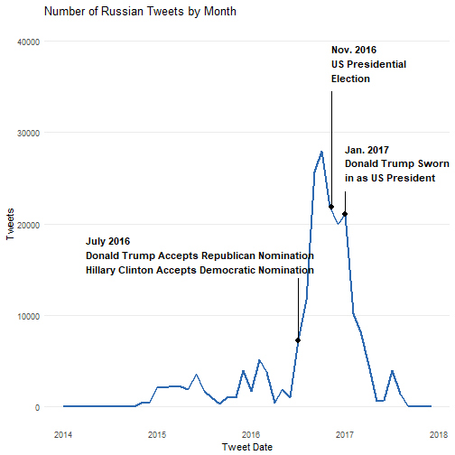
Even though the most of the Russian Twitter bots were created in 2013 and 2014, we can see that only a relatively small amount of tweets were made in 2014. Eventually they started tweeting the tens of thousands in the months preceding and following the 2016 presidential election. The tweets per month peak in October, one month before the election and drop off after the inauguration of Donald Trump as president.
#count tweets by day
tweets.weekday <- tweets %>%
  group_by(year, month, week, weekday) %>%
  summarize(n = n()) %>%
  drop_na() %>%
  ddply(.(month), transform, monthweek = 1 + week - min(week))

#plot heatmap
ggplot(data = tweets.weekday,
       aes(x = monthweek, y = weekday, fill = n)) +
  geom_tile(size = 0.2, color = "#F0F0F0") +
  facet_grid(year~month) +
  theme_minimal() +
  scale_fill_viridis(name = '# of Tweets', direction = -1) +
  theme(axis.title = element_text(size = 6),
              axis.ticks = element_blank(),
              axis.text = element_text(size = 5),
              panel.grid.major.y = element_blank(),
              panel.grid.major.x = element_blank(),
              panel.grid.minor = element_blank(),
              plot.title = element_text(size = 10),
              legend.title = element_text(size = 6),
              legend.key.width = unit(1, "cm"),
              legend.text = element_text(size = 6),
              legend.key.size = unit(0.2, "cm"),
              strip.text = element_text(#hjust = 0,
                                        #face = "bold",
                                        size = 7)) +
  ggtitle('Tweets by Weekday') +
  xlab('\nWeek of Month') +
  ylab('Weekday')
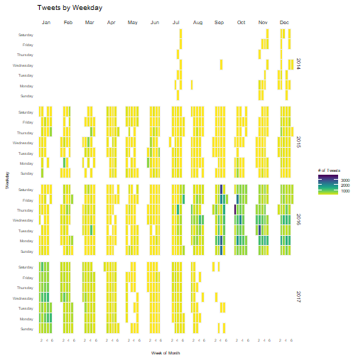
I noticed that the bots tweeted for several weeks each in July, then tweeted only once during August and September before starting again in November. Perhaps the Russians tested their bots in July, before making changes and starting again in November.
tweets.hourly <- tweets %>%
  group_by(hour, weekday, year) %>%
  summarize(n = n()) %>%
  drop_na()

ggplot(data = tweets.hourly,
       aes(x = hour, y = weekday, fill = n)) +
  geom_tile(size = 0.2, color = '#F0F0F0') +
  theme_minimal() +
  #facet_wrap(~year) +
  scale_fill_viridis(name = "# of Tweets", direction = -1) +
  theme(axis.title = element_text(size = 6),
              axis.ticks = element_blank(),
              axis.text = element_text(size = 5),
              panel.grid.major.y = element_blank(),
              panel.grid.major.x = element_blank(),
              panel.grid.minor = element_blank(),
              plot.title = element_text(size = 10),
              legend.title = element_text(size = 6),
              legend.key.width = unit(1, "cm"),
              legend.text = element_text(size = 6),
              legend.key.size = unit(0.2, "cm"),
              strip.text = element_text(size = 7)) +
  ggtitle("Tweets by Hour") +
  xlab('Hour') +
  ylab('Weekday')
Text Analysis
Let's go more in depth as to the content of the Russian tweets. I decided to make word clouds for each year in the dataset to see how the content of the tweets changed over time. Before creating the word clouds the text data needed to be cleaned of Russian words as well as common words and symbols used in tweets such as "RT" for "retweet."
#convert tweets to english and subset the data by year
tweets.year <- function(my_year){
  tweets.english <- tweets %>%
  filter(year == my_year) %>%
  #convert to latin to eliminate russian words from the corpus
  mutate(iconv(text, "latin1", "ASCII")) %>%
  drop_na()
  return(tweets.english)
}

#this function makes a corpus of tweets from a specific year
corpus_year <- function(my_year) {
  tweets.english <- tweets.year(my_year)

  #remove twitter handles
  tweets.english$text <- gsub("@\\w+", "", tweets.english$text)
  #remove links
  tweets.english$text <- gsub("http\\w+", "", tweets.english$text)

  tweet.corpus <- Corpus(VectorSource(tweets.english$text))
  tweet.corpus <- tm_map(tweet.corpus, PlainTextDocument)
  tweet.corpus <- tm_map(tweet.corpus, tolower)
  tweet.corpus <- tm_map(tweet.corpus, removeNumbers)
  tweet.corpus <- tm_map(tweet.corpus, removePunctuation)
  tweet.corpus <- tm_map(tweet.corpus,
                         removeWords,
                         stopwords("English"))
  #remove RT and ampersand
  tweet.corpus <- tm_map(tweet.corpus,
                         removeWords,
                         c("amp", "RT"))
  tweet.corpus <- tm_map(tweet.corpus, stripWhitespace)
  return(tweet.corpus)
}

#function to make a word cloud
wordcloud_year <- function(my_year, my_scale){
  tweet.corpus <- corpus_year(my_year)
  #set.seed to ensure the word cloud looks the same everytime
  set.seed(10000)
  wordcloud(tweet.corpus,
            max.words = 150,
            random.order = FALSE,
            random.color = FALSE,
            scale = my_scale,
            colors = viridis(n = 100, end = 0.92))
}

wordcloud_year(2014, c(4, 0.5)) +
  title("Most Frequent Words of 2014")
## integer(0)
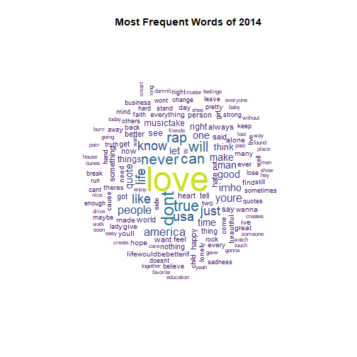
It appears that the Russians kept a low profile in 2014, as their tweet content seems largely apolitical.
wordcloud_year(2015, c(2.5, 0.25)) +
  title("Most Frequent Words of 2015")
## integer(0)
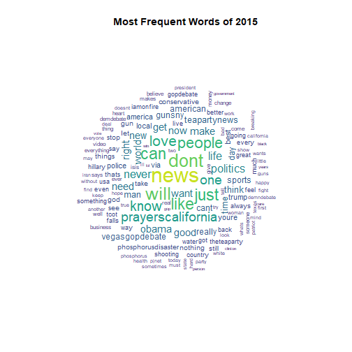
In 2015 the trolls began to talk about divisive issues such as the presidential election, the Tea Party, ISIS, as well as the mass shooting in San Bernadino, California.
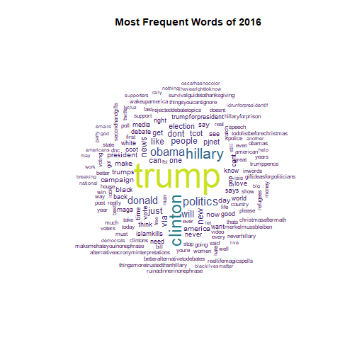
wordcloud_year(2016, c(4, 0.5)) +
  title("Most Frequent Words of 2016")
## integer(0)
During the election year the Twitter trolls talked the most about Hillary Clinton and Donald Trump, with "Trump" appearing over twice as often as "Clinton". They also continued tweeting about other divisive topics like the Black Lives Matters movement and the refugee crisis.
tweet.corpus.2016 <- corpus_year(2016)

tdm <- TermDocumentMatrix(tweet.corpus.2016,
                          control = list(wordLengths = c(1, Inf)))
#the corpus was too big to turn into a matrix so we need to remove sparse terms
tdm2 <- removeSparseTerms(tdm, 0.9997)
mat <- as.matrix(tdm2)
## Error: cannot allocate vector of size 1.8 Gb
freq.mat <- data.frame(term = rownames(mat),
                      freq = rowSums(mat),
                      row.names = NULL)
## Error in rownames(mat): object 'mat' not found
freq.mat2 <- freq.mat %>%
  filter(term == 'trump' |
           term == 'clinton' |
           term == 'sanders' |
           term == 'stein' |
           term == 'johnson'|
           term == 'rubio' |
           term == 'carson' |
           term == 'cruz') %>%
  arrange(desc(freq))
## Error in eval(lhs, parent, parent): object 'freq.mat' not found
# Barplot of candidate names.
freq.mat2 %>%
    mutate(term = fct_reorder(term, freq, .desc = TRUE)) %>%
    ggplot(aes(x = term, y = freq)) +
  geom_bar(stat = 'identity', fill = "#1F83B4") +
  theme_minimal() +
  theme(panel.grid.major.x = element_blank(),
        panel.grid.minor = element_blank(),
        axis.title.y = element_blank()) +
  ggtitle("Frequency of Candidate Names in 2016") +
  scale_x_discrete(labels =  c('Trump', 'Clinton', 'Cruz', 'Sanders', 'Carson',
                               'Rubio', 'Johnson', 'Stein')) +
  labs(x = 'Candidate')
## Error in eval(lhs, parent, parent): object 'freq.mat2' not found
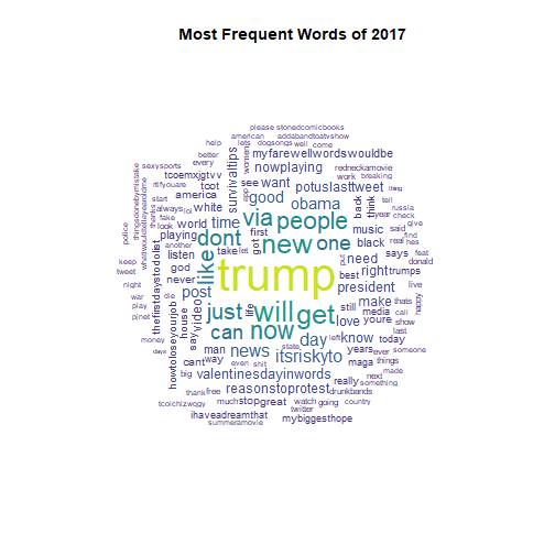
wordcloud_year(2017, c(3.5, 0.25)) +
  title("Most Frequent Words of 2017")
## integer(0)
The Trolls
# Count the number of total tweets, replies, and RTs for each user.
users_tweets <- select(tweets, c(user_key, text))

cookies <- users_tweets %>%
    group_by(user_key) %>%
    summarise(total=length(text),
            #hashtags=sum(str_count(text,"#(\\d|\\w)+")),
            replies=sum(str_count(text,"^(@)")),
            rt=sum(str_count(text,"^(RT)"))
            #urls=sum(str_count(text,"^(([^:]+)://)?([^:/]+)(:([0-9]+))?(/.*)"))
    ) %>%
  arrange(desc(total))

cookies$original_content <- cookies$total - cookies$rt - cookies$replies
cakes <- users_tweets %>%
    summarise(total=length(text),
          replies=sum(str_count(text,"^(@)")),
            rt=sum(str_count(text,"^(RT)"))
    )
cakes$other <- cakes$total - cakes$rt - cakes$replies
cakes <- select(cakes, -total) %>%
  melt()

# Make the waffle chart
cupcakes <- c('Replies (1.5%)' = cakes[,2][1], 'Retweets (72.5%)' = cakes[,2][2],
              'Original Content (30.0%)' = cakes[,2][3])
waffle(cupcakes/1000, colors = c("#F02720", "#1F83B4", "#FF810E"),
       title = 'Types of Troll Twitter Content')
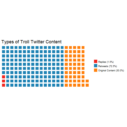
The trolls focused most of their efforts on retweeting content made by other Russian troll accounts as well as retweeting and replying to popular Twitter users to gain more followers.
dough <- cookies %>%
  top_n(15, total) %>%
  select(c('user_key', 'replies', 'rt', 'original_content'))%>%
  melt('user_key') %>%
  arrange(variable)

ggplot(data = dough[order(dough$variable, decreasing = T),],
       aes(x = reorder(user_key, value),
                         y = value,
           fill = factor(variable, levels=
                           c("replies", "original_content", "rt")))) +
  geom_bar(stat="identity") + coord_flip() +
  scale_fill_manual(values = c("#F02720", "#FF810E", "#1F83B4"),
                    name = 'Types of Troll\nTwitter Content',
                    breaks = c('replies', 'original_content', 'rt'),
                    labels = c('Replies', 'Original Content', 'Retweets')) +
  theme_minimal() +
  theme(panel.grid.major.y = element_blank()) +
  labs(x = 'Twitter Handle') +
  theme(axis.title.x = element_blank()) +
  ggtitle('Types of Twitter Content by User')
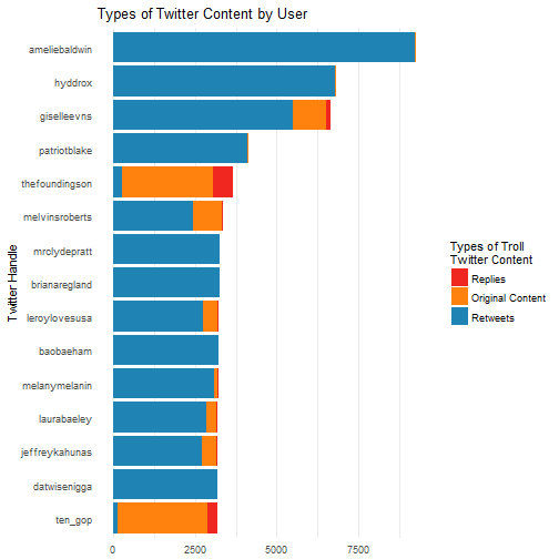
Here are the top fifteen accounts with the most tweets. Most of the accounts were focused on retweeting content instead of creating original tweets. That said, a small number of accounts were focused on doing the exact opposite, such as the account "TEN_GOP", which was posing as an account run by the Tennessee Republican Party.
ggplot(data = users, aes(x = followers_count, y = statuses_count)) +
  geom_jitter(color = '#1696AC', alpha = 0.5, size = 1.5) +
  theme_minimal() +
  geom_text_repel(label =
    ifelse(users$followers_count>30000 | users$statuses_count>35000,
    as.character(users$screen_name),
    ''),
    size = 2.5) +
  labs(x = 'Followers', y = 'Tweets') +
  ggtitle('Users Tweets and Followers')
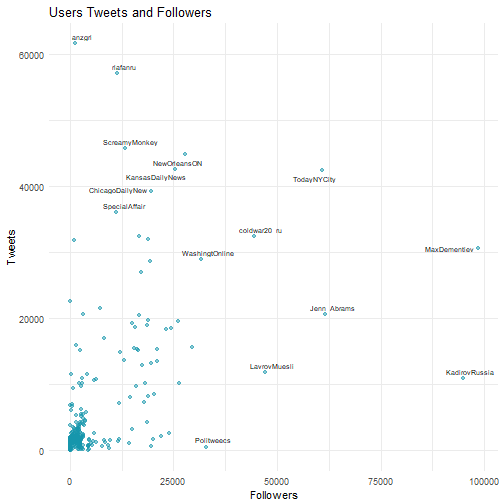
Most accounts had a relatively low amount of followers, which is pretty normal; one data scientist found that for Twitter users with less than 100,000 followers, the average number of followers was 453. Some of the accounts with the highest amount of tweets and followers were accounts posing as news organizations.
One of the most well known accounts belonged to the fictional blogger Jenna Abrams, who was famous for her opinionated tweets and highly controversial opinions.
Conclusion
This dataset was interesting to work with and definitely has potential to be investigated further or applied to machine learning. Perhaps this data could be used to identify suspicious social media accounts and potential bots to prevent foreign entities from interfering in future U.S. elections.
References
https://www.kaggle.com/vikasg/russian-troll-tweets
https://www.nbcnews.com/tech/social-media/now-available-more-200-000-deleted-russian-troll-tweets-n844731
http://tidyr.tidyverse.org/reference/separate.html
https://stackoverflow.com/questions/37129178/converting-character-to-time-in-r
https://stackoverflow.com/questions/43501670/complete-column-with-group-by-and-complete
https://rud.is/b/2016/02/14/making-faceted-heatmaps-with-ggplot2/
https://rpubs.com/haj3/calheatmap
http://www.latimes.com/world/europe/la-fg-russia-election-meddling-20170330-story.html
https://stackoverflow.com/questions/18153504/removing-non-english-text-from-corpus-in-r-using-T
http://www.sthda.com/english/wiki/text-mining-and-word-cloud-fundamentals-in-r-5-simple-steps-you-should-know
https://www.datasciencecentral.com/profiles/blogs/find-out-what-celebrities-tweet-about-the-most-1
https://stackoverflow.com/questions/21589254/remove-urls-from-strings
https://stackoverflow.com/questions/24224298/filter-rows-documents-from-document-term-matrix-in-r
https://stackoverflow.com/questions/5208679/order-bars-in-ggplot2-bar-graph
http://www.salemmarafi.com/code/counting-tweets-in-r/
https://stackoverflow.com/questions/15624656/label-points-in-geom-point
https://kickfactory.com/blog/average-twitter-followers-updated-2016/
https://www.thedailybeast.com/jenna-abrams-russias-clown-troll-princess-duped-the-mainstream-media-and-the-world