Exploration of TSA Claims Data
- By Quentin Ikeno
- Mon 19 February 2018
Introduction
The Transportation Security Administration (TSA) is an agency of the U.S. Department of Homeland Security, responsible for the public saftey of travelers in the United States.
Here we will be exploring claims data against the TSA from 2002 to 2015.
Univariate Plots Section
## 'data.frame':    204267 obs. of  13 variables:
##  $ Claim.Number : Factor w/ 204244 levels "0102000M","0102001M",..: 20607 3415 3440 20621 57867 57990 102677 28580 28584 44333 ...
##  $ Date.Received: Factor w/ 4008 levels "","1-Apr-03",..: 3253 1475 3242 3632 1201 1201 3011 1641 1641 2288 ...
##  $ Incident.Date: Factor w/ 26808 levels "","01-APR-0200 00:00",..: 6879 533 5781 1774 10387 9453 14474 17503 18138 17155 ...
##  $ Airport.Code : Factor w/ 466 levels "","-","ABE","ABI",..: 140 400 424 290 278 75 340 71 341 30 ...
##  $ Airport.Name : Factor w/ 486 levels ""," Albert J Ellis; Jacksonville",..: 313 403 236 284 329 8 346 26 347 175 ...
##  $ Airline.Name : Factor w/ 319 levels "","-","ATA Aerocondor",..: 120 1 66 66 132 47 301 273 1 1 ...
##  $ Claim.Type   : Factor w/ 12 levels "","-","Bus Terminal",..: 11 11 11 11 11 8 8 1 11 8 ...
##  $ Claim.Site   : Factor w/ 7 levels "","-","Bus Station",..: 5 4 4 5 5 4 4 5 5 5 ...
##  $ Item         : Factor w/ 4705 levels "","-","Alcoholic beverages",..: 4527 4392 2266 4392 363 4527 4632 2517 3238 4262 ...
##  $ Claim.Amount : Factor w/ 36118 levels "","$0.00 ","$0.48 ",..: 19479 111 14684 25645 33539 24008 503 31794 16231 25382 ...
##  $ Status       : Factor w/ 16 levels "","-","Approve in Full",..: 4 16 16 4 4 16 4 4 5 9 ...
##  $ Close.Amount : Factor w/ 17163 levels "","$0.00 ","$0.48 ",..: 9621 12225 6225 12225 15946 6198 377 15022 1 1 ...
##  $ Disposition  : Factor w/ 4 levels "","Approve in Full",..: 2 4 4 2 2 4 2 2 1 3 ...
This dataframe contains 204,267 obvservations of 13 variables.
## [1] 68952
There some columns in the dataframe with missing data. For example, there are 68,952 missing values for close amount. I made a quick look through the data and it appears that the TSA stopped recording the close amount in the claims data, starting from 2010.
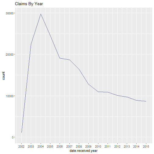
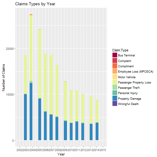
Two things about this graph caught my eye. First, there is a relatively low amount of claims for 2002, with a large jump in claims after 2002. What could have possibly caused this?
One explanation could be that in 2002 claims were lower because the TSA did not
handle the screening of passengers and baggage at every airport in America
(screenings at airports before 2002 were handled by private security firms).
However, that changed when the TSA was required to screen all passengers at U.S. commercial aiports by November 19, 2002 and to screen all checked baggage by
December 31, 2002. Subsequently, claims went up in 2003 after the policy
changes took effect.
Another possibility is that claims were low because there fewer people flying since air travel in the United States was down in the aftermath of September 11, 2001.
The other thing I noticed was that the number of claims appears to decrease after 2004 and level off around 2010.
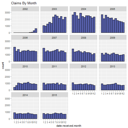
From this plot we can see that the number of claims started increasing around late 2002, peaking in 2003, then start to decrease around 2004. There doesn't appear to any particular month or travel season when claims increase.
##
##        John F. Kennedy International
##                                 9232                                 8524
##    Los Angeles International Airport         Newark International Airport
##                                 7260                                 6866
## Chicago O'Hare International Airport          Miami International Airport
##                                 6843                                 6432
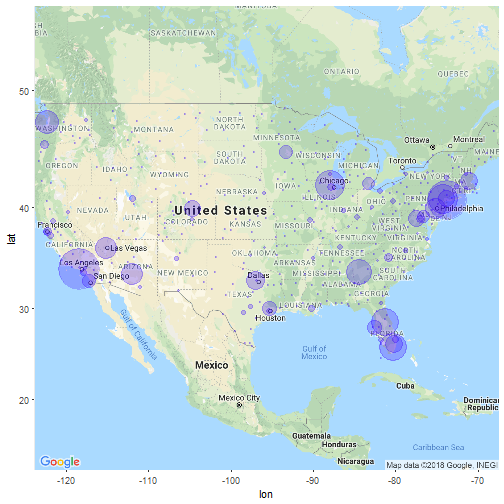
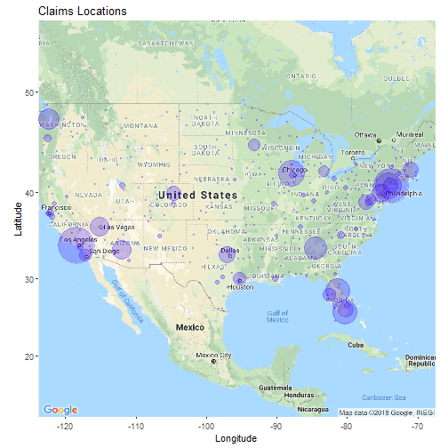
Here is a table of the top five airports where the most claims were made. The results aren't too surprising considering these are also some of the busiest airports in the U.S. According to ABC news, each of these airports are in the top 20 of airports where TSA employees were fired for theft.
Below is a map of the U.S. where TSA claims were filed, where the bubble size represents the number of claims.
##
##                                      Other
##                                      36908
##  Luggage (all types including footlockers)
##                                      19128
## Clothing - Shoes; belts; accessories; etc.
##                                      14937
##                             Jewelry - Fine
##                                       9902
##                                      Locks
##                                       9570
##                          Cameras - Digital
##                                       9171
Here are the five most common items claims were filed for. At first I did not expect digital cameras to be on this list but then I remembered this data goes back to 2002.
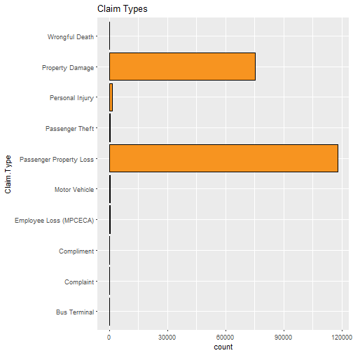
##
## Passenger Property Loss         Property Damage
##                  117868                   75364                    7913
##         Personal Injury  Employee Loss (MPCECA)         Passenger Theft
##                    1465                     485                     465
##           Motor Vehicle                       -               Complaint
##                     369                     282                      48
##          Wrongful Death              Compliment            Bus Terminal
##                       4                       3                       1
I was not very surprised that passenger property loss was the most common complaint. However, I did not expect to see there were four wrongful death complaints as well as three compliments.
## # A tibble: 4 x 2
##   Disposition         n
##   <fct>           <int>
## 1 Deny            96661
## 2 Approve in Full 47374
## 3 Settle          33733
## 4 ""              26499
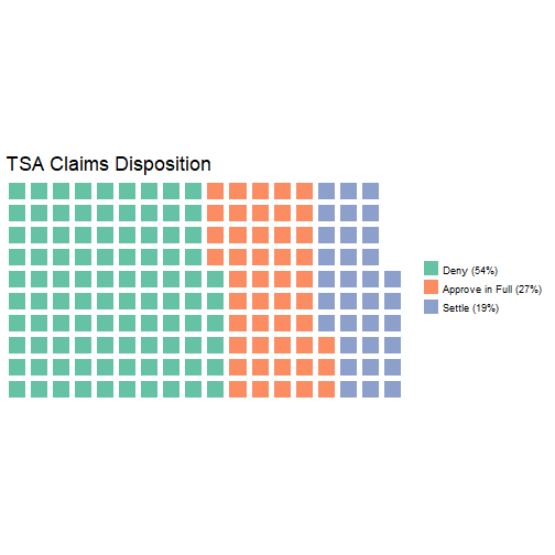
Looking at the disposition for all claims, there are 26499 missing dispositions (about 13% of the data). If we take out the missing data, it turns out over half of all claims are denied, while the rest are settled or approved.
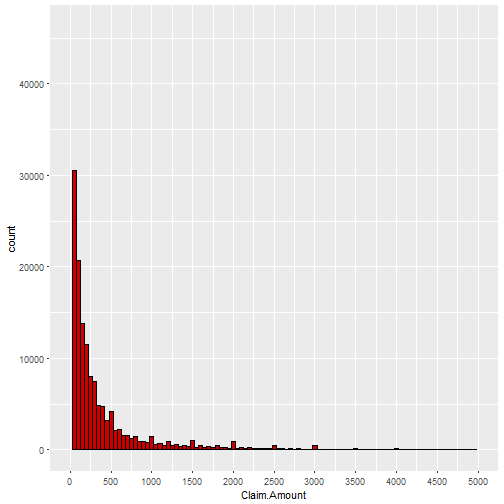
##     Min.  1st Qu.   Median     Mean  3rd Qu.     Max.     NA's
## 0.00e+00 2.70e+01 1.15e+02 1.61e+07 3.50e+02 3.00e+12    16795
Here is a histogram of claim amounts. The data appears skewed left where relatively small claims seems to be more common than larger claims. The median claim amount is $105 while the mean is $1,003, meaning that there must be some very large claims that are affecting the mean. Sure enough, we can see that the max amount is $27,220,000.
Univariate Analysis
What is the structure of your dataset?
This dataset contains 204,267 different claims with 13 features for each claim:
Claim Number
Date Received
Incident Date
Airport Code
Airport Name
Airline Name
Claim Type
Claim Site
Item
Claim Amount
Status
Close Amount
Disposition
Some of these, such as Close Amount and Claim Type contain missing data.
What is/are the main feature(s) of interest in your dataset?
The main features of interest in the dataset are date received, claim type, claim amount, status, and close amount.
What other features in the dataset do you think will help support your investigation into your feature(s) of interest?
I am interested if there is any relation between an airline and claim type.
Did you create any new variables from existing variables in the dataset?
I created three new variables by separating each date received entry by year, month, and day.
I also found another dataset that contained the longitude and latitude for airports listed by their IATA airport code. I then joined data from that dataset and combined it with the data from the TSA dataset to plot the location of each airport on the bubble map of TSA claims locations.
Of the features you investigated, were there any unusual distributions? Did you perform any operations on the data to tidy, adjust, or change the form of the data? If so, why did you do this?
There were some date received entries that had dates before 2002 and past 2015. I fixed this by changing the date received year to be the same year as the incident date year.
In addition, I removed the semicolon and dollar sign from the strings for the claim amount and close amount and then converted it to numeric data.
I also changed all the incident dates and received dates, which were in mutiple formats, to a single date format.
Bivariate Plots Section
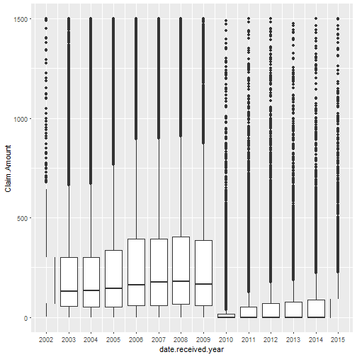
It appears that the median claim amount seems to decrease after 2009. This could be related to the fact that the number of claims decreased after 2010 compared to previous years. In October 2009, the TSA announced that it would purchase new or upgrade existing closed circuit television systems at aipports accros the country, which could be an explain the drop in claims and the drop in median claim amounts.
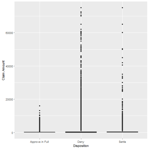
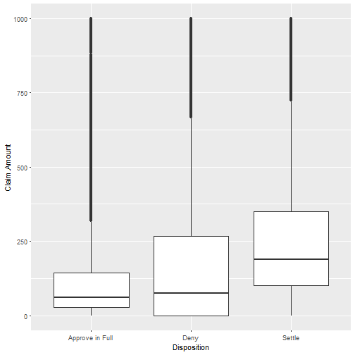
These boxplots had many outliers making the plots difficult to see, which is why I decided to take away some of the outliers by limiting the y-axis. We can see from the first plot that the TSA did not approve in full any claims above $1600. Furthermore, it is seems that the TSA attempted to settle or deny the most expensive of claims rather than approving them.
##
##  Pearson's product-moment correlation
##
## data:  tsa$Claim.Amount and tsa$Close.Amount
## t = -0.10646, df = 134000, p-value = 0.9152
## alternative hypothesis: true correlation is not equal to 0
## 95 percent confidence interval:
##  -0.005644883  0.005063281
## sample estimates:
##           cor
## -0.0002908097
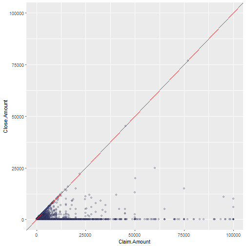
With this next plot, I was interested to see how the amount people claimed compared to the amount they eventually received. I included a red line to indicate where the amount claimed is equal to the close amount.
For very high claim amounts, very few claims recieved the full amount they asked for.
One thing that caught my eye is that there were a few claims of $0 or near $0 that had close amounts higher than their claim amounts. If I had to guess as to why this was the case, I would say that these are probably errors in the data.
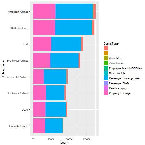
Here are the top eight airlines listed in the claims. There doesn't seem to be anything interesting here, since the proportions of each claim type for each claim type appear pretty similar across the airlines. Also, the top airlines with the most claims are also some of the airlines that fly the most amount of passengers.
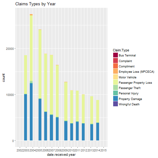
Nothing too surprising with this plot as Passenger Property Loss and Property Damage seem to be the most common complaint across all years.
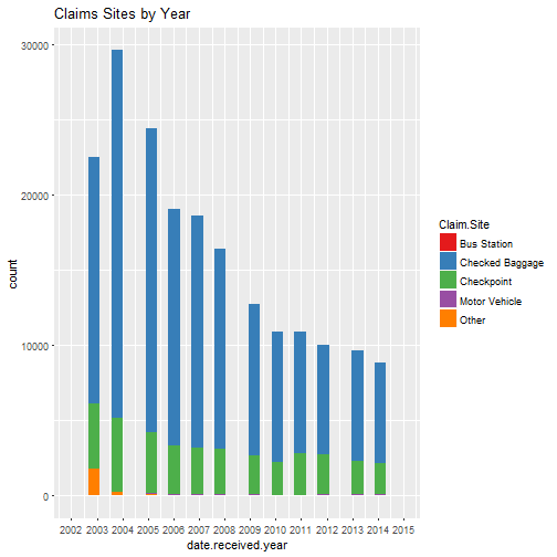
The two most frequent claim sites listed for each year are checked baggage, and checkpoint.
Counts for claims with the claim site listed as checked baggage appear to decrease after 2004 while counts for claims with claim site listed as checkpoint do not change quite as much. It is not obvious as to why this is. It could be that the TSA has improved its measures to prevent agents from damaging or stealing items from luggage, or perhaps passengers over time start to be more careful and pack items they do not want stolen in their carry-on luggage, or passengers are simply checking in less baggage because of airlines charging baggage fees.
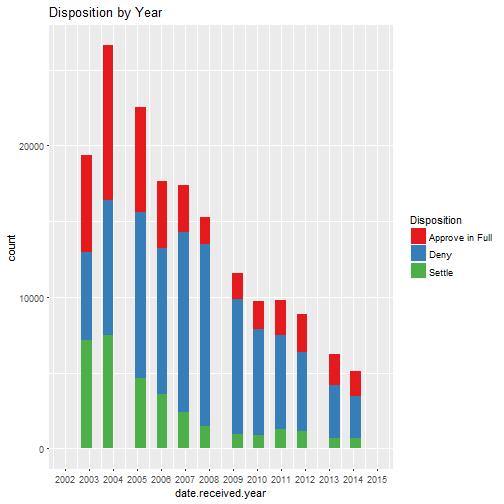
The proportion of claims denied appears to increase around 2006 or 2007.
Bivariate Analysis
Did you observe any interesting relationships between the other features (not the main feature(s) of interest)?
Unfortunately, my analysis of airline and claim type did not yield any unexpected results.
What was the strongest relationship you found?
The only two continuous variables I compared were claim amount and close amount. They do not have a very strong relationship, as their correlation coefficient is essentially zero.
Multivariate Plots Section
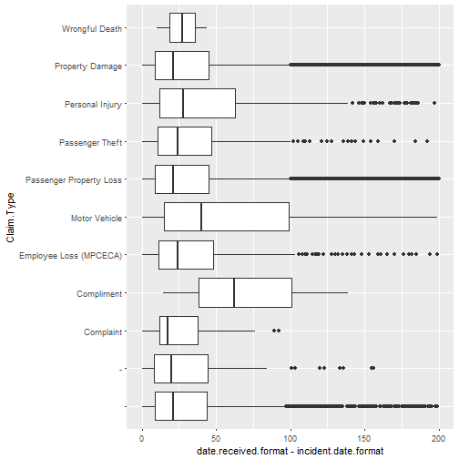
These box and whisker plots compare the number of days between the incident date and the date the claim was received for across each type of claim. The median difference in time appears fairly similar across all different claim types, except for possibly the compliment claim type, though since there were only four claims with compliments in the data, this may not be a very good indicator of what the actual median should be.
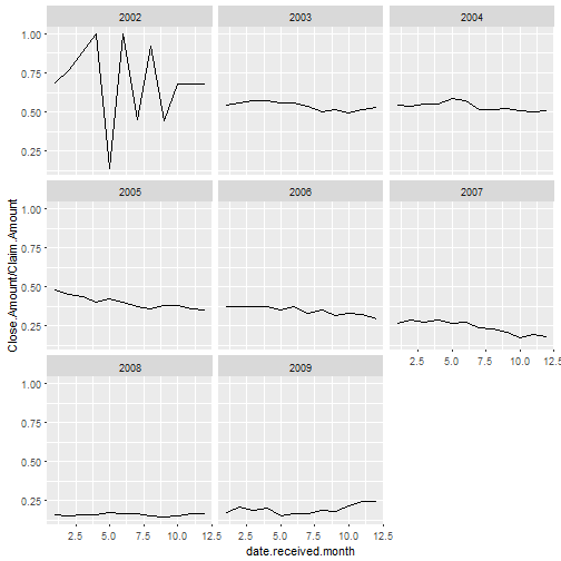
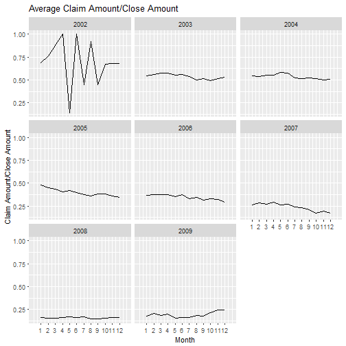
Here we have the average of the close amount divided by the claim amount for each month from 2002 to 2009. The ratio appears to be somewhat sporadic during 2002, most likely because there were relatively few claims during 2002.
The ratio decreases over time until levelling off in 2008.
Multivariate Analysis
Talk about some of the relationships you observed in this part of the investigation. Were there features that strengthened each other in terms of looking at your feature(s) of interest?
Looking at claim amount divided by close amount over time seemed to be an important relationship as this ratio seemed to decrease with time.
Were there any interesting or surprising interactions between features?
It was interesting for me to see how the average claim amount over close amount decreased over time since it shows that less money is being given out compared to the amount being asked asked for as the years go by.
Final Plots and Summary
Plot One
Description One
The airports with the most claims are tend to be heavily trafficked airports in large cities such as JFK International Airport in New York or LAX in Los Angeles.
Plot Two
Description Two
The number of claims peak in 2004 and decrease in subsequent years. The most common form of claims for all years are passenger property loss and property damage.
Plot Three
Description Three
The average ratio appears to fluctuate a lot in 2002, which is probably because of the relatively few amount of claims during that year. However after 2002, changes become more gradual and over time the average claim amount/close amount decreases and until it levels off in 2008.
Reflection
Issues
While working on this project I encountered issues using this dataset. The most significant problem is that there were missing data. For instance, there
were no data for close amount after 2009, which was six years of missing data.
Another issue was that dates were given in two different formats that needed to
be converted to a single format, which I was able to do with assistance from
an instructor on Live Help. Finally, data for items listed in the claims needed
to be cleaned. Given more time, I would have liked to have explored the
different items given and their relationships to the other variables.
One limitation of this dataset is that we do not have any data on the total number of travellers who pass through TSA screening. For a more complete investigation, I would have liked to have seen how the number of claims compare to the overall count of people who are screened by the TSA over time.
Another limitation is that we cannot assess the validity of all of the claims. It is possible that some of these claims could be fraudulent. Furthermore, some items stolen from passenger luggage could have been stolen by airline employees or airport baggage handlers and the TSA was mistakenly blamed.
Conclusion
After doing this exploratory data analysis I think air travellers will have some mixed feelings about the results. On one hand, I think most will be pleased to know that TSA claims have been decreasing since 2004, which is a sign that the agency may be improving its measures to prevent damage and theft of passengers' personal belongings. On the other hand, for those who are victims of theft, the fact that over 50% of all claims between 2002 and 2015 were denied may not be a satisfying outcome.